


Technical Analysis: Forex Markets Technical Analysis
Technical Analysis: Forex Markets Technical Analysis
Expertly analyze the global Forex markets with technical analysis from our team of professionals. Get reliable insights and predictions to help you make better decisions when trading. Make sure to stay up-to-date on the latest market news and trends with our comprehensive
-

- by ALLFOREXRATING.COM
- 6th May 2023 | Post Views: 1959
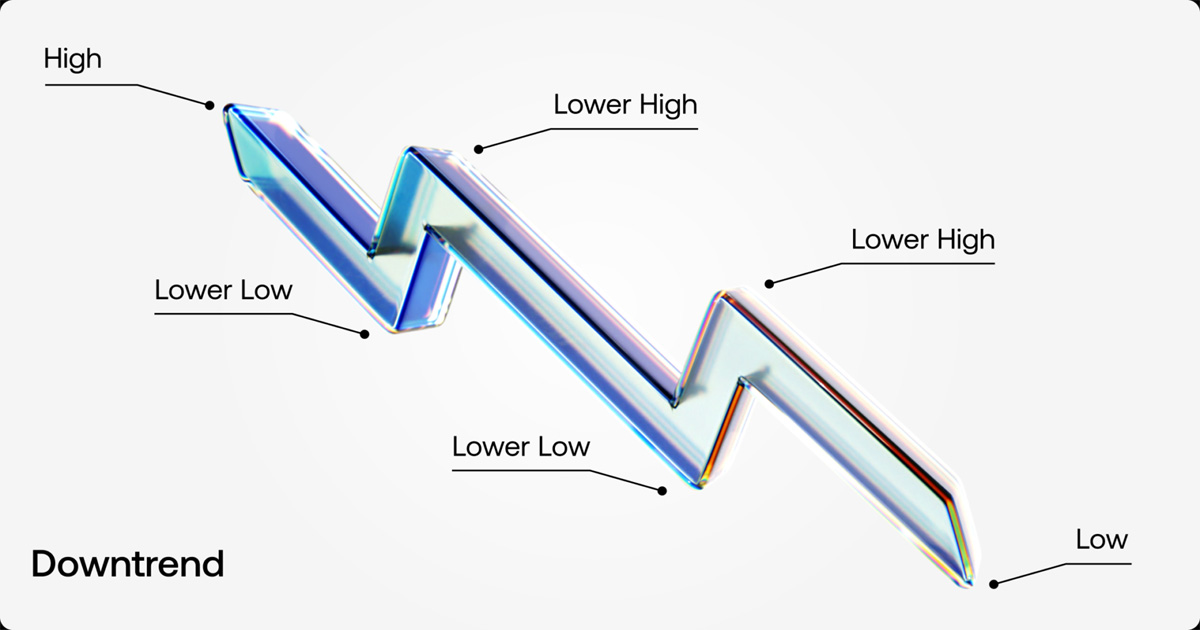
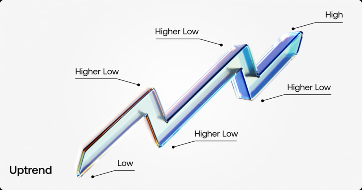
Trendlines
Keep up with the latest trends in forex markets with our technical analysis tools. Analyze multiple currencies and track your portfolio performance with our interactive charts, customizable indicators, and real-time data. Get started now to start trading smarter.
Trendlines are distinctive lines that traders draw on charts to link a sequence of prices or demonstrate the best fit for specific data. The trader can then utilize the resulting line to get a solid indication of the potential direction of an investment’s value movement.
A trendline is a line drawn above or below pivot highs or lows to indicate the price’s primary direction. Support and resistance in any time frame are represented visually by trendlines. They depict patterns during times of price contraction and show the direction and pace of the price.
An analyst needs at least two points on a price chart before they can draw a trendline. Different time frames, including one minute or five minutes, are preferred by some analysts. Others examine weekly or daily charts for long-term trades.
Some analysts completely disregard time, opting to examine patterns using tick intervals rather than time intervals. The fact that trendlines may be utilized to discern trends regardless of the time period, time frame, or interval used is what makes them so ubiquitous in their application and allure.
What Happens When a Trendline is Broken?
Notice how the pair was trending higher for a few weeks and tested its trend line multiple times, which kept supporting the price further until the pair broke the trendline and hold below that line, leading to an acceleration to the downside, declining by almost 50% of the up move.
The same concept of a broken uptrend but the opposite. Notice how the pair was trending lower for a few days. Then, the pair broke that trendline and managed to hold for a few days over that trendline, leading to a new uptrend, recovering over 80% of the recent decline.
Fibonacci
Fibonacci Retracement Levels: What Are They?
Fibonacci retracement levels, which derive from the Fibonacci sequence, are horizontal lines that show potential areas of support and resistance.
A percentage is connected to each level. How much of a previous move the price has retraced is shown by the percentage. There are four Fibonacci levels for retracement: 23.6%, 38.2%, 61.8%, and 78.6% Even though it’s not really a Fibonacci ratio, 50% is also employed.
The indication can be drawn between any two important price points, such as a high and a low, making it handy. The levels between those two spots will subsequently be created by the indicator.
How to Use Fibonacci Levels?
Fibonacci levels can be used either in an uptrend or a downtrend move. In both cases, it can be used to figure out a good entry, whether you are buying or selling.
When a currency is in an uptrend, most traders will be looking for any dip or a slight decline before they buy it for a possible uptrend continuation. In this case, Fibonacci took can be drawn from the recent low to the recent high, then traders will be looking to buy at Fibonacci levels.
In the example above, the pair managed to rise for a few days before peaking, then the pair retraced by 61.8% which is called the golden ratio. Notice how the pair touched that level and spiked higher once again. The Fibonacci golden ratio could be considered the best entry tool in trading Fx pairs.
Example of Downtrend Fibonacci level
On the flip side, the downtrend Fibonacci retracement is the exact opposite. As shown in the example above. The pair has been declining steadily for a few days before it found some support. The pair started to retrace higher. Traders will be looking to sell (short) the pair again at the Fibonacci golden ratio. Notice how the pair touched that ratio and declined back right from that area.
Moving Averages
A moving average (MA) is a stock indicator used frequently in technical analysis in the world of finance. The purpose of generating a stock’s moving average is to create a continuously updated average price in order to assist smooth out the price data. The effects of random, short-term changes on the price of a stock over a given time period are reduced by using the moving average calculation.
A stock’s trend direction can be found by calculating a moving average, as well as a stock’s support and resistance levels. Due to the fact that it is reliant on previous prices, it is a trend-following or lagging indicator.
The latency increases with increasing moving average period. Since a 200-day moving average includes prices for the previous 200 days, it will lag significantly more than a 20-day MA. Investors and traders frequently monitor the 50-day and 200-day moving average values, which are regarded as crucial trading signals. Depending on their trading goals, investors can select several periods of differing lengths to calculate moving averages. Longer-term moving averages are more suited for long-term investors, whereas shorter moving averages are often utilized for short-term trading.
While it is impossible to foresee how a particular stock will move in the future, using technical analysis and research can help with forecasts.
The security is in an uptrend if its moving average is increasing, whereas a downtrend is indicated by a moving average that is decreasing. A bullish crossover, which happens when a short-term moving average crosses above a longer-term moving average, also confirms upward momentum. On the other hand, a bearish crossover, which happens when a short-term moving average crosses below a longer-term moving average, confirms downward momentum.
Notice how the Euro has been declining steadily since the pair crossed below the 50-day moving average. Each time the pair tried to break above that moving average, it acted as a resistance level and the euro declined back, continuing its downward trend.
Notice how the Swiss Franc managed to rally for almost a month since it crossed over its 100 DAY moving average. Throughout the move, USDCHF made multiple downside retracements, but each time it tested that moving average, it acted as support and pushed the pair higher, continuing its uptrend journey.
Relative Strength Index (RSI)
Technical analysis uses the relative strength index (RSI), a momentum indicator. To assess whether a security’s price is overvalued or undervalued, RSI evaluates the speed and amplitude of recent price fluctuations.
An oscillator (a line graph) representing the RSI is shown, with a scale from 0 to 100. J. Welles Wilder Jr. created the indicator, which he first published in his groundbreaking 1978 book New Concepts in Technical Trading Systems.
Beyond identifying overbought and oversold assets, the RSI has other capabilities. It may also signal assets that are poised for a price correction or trend reversal. It can serve as a buying and selling cue. An overbought scenario is generally indicated by an RSI reading of 70 or higher. An oversold state is indicated by a value of 30 or lower.
Write a Comment
Technical Analysis: Forex Markets Technical Analysis
Expertly analyze the global Forex markets with technical analysis from our team of professionals. Get reliable insights and predictions to help you make better decisions when trading. Make sure to stay up-to-date on the latest market news and trends with our comprehensive
Trendlines
Keep up with the latest trends in forex markets with our technical analysis tools. Analyze multiple currencies and track your portfolio performance with our interactive charts, customizable indicators, and real-time data. Get started now to start trading smarter.
Trendlines are distinctive lines that traders draw on charts to link a sequence of prices or demonstrate the best fit for specific data. The trader can then utilize the resulting line to get a solid indication of the potential direction of an investment’s value movement.
A trendline is a line drawn above or below pivot highs or lows to indicate the price’s primary direction. Support and resistance in any time frame are represented visually by trendlines. They depict patterns during times of price contraction and show the direction and pace of the price.
An analyst needs at least two points on a price chart before they can draw a trendline. Different time frames, including one minute or five minutes, are preferred by some analysts. Others examine weekly or daily charts for long-term trades.
Some analysts completely disregard time, opting to examine patterns using tick intervals rather than time intervals. The fact that trendlines may be utilized to discern trends regardless of the time period, time frame, or interval used is what makes them so ubiquitous in their application and allure.
What Happens When a Trendline is Broken?
Notice how the pair was trending higher for a few weeks and tested its trend line multiple times, which kept supporting the price further until the pair broke the trendline and hold below that line, leading to an acceleration to the downside, declining by almost 50% of the up move.
The same concept of a broken uptrend but the opposite. Notice how the pair was trending lower for a few days. Then, the pair broke that trendline and managed to hold for a few days over that trendline, leading to a new uptrend, recovering over 80% of the recent decline.
Fibonacci
Fibonacci Retracement Levels: What Are They?
Fibonacci retracement levels, which derive from the Fibonacci sequence, are horizontal lines that show potential areas of support and resistance.
A percentage is connected to each level. How much of a previous move the price has retraced is shown by the percentage. There are four Fibonacci levels for retracement: 23.6%, 38.2%, 61.8%, and 78.6% Even though it’s not really a Fibonacci ratio, 50% is also employed.
The indication can be drawn between any two important price points, such as a high and a low, making it handy. The levels between those two spots will subsequently be created by the indicator.
How to Use Fibonacci Levels?
Fibonacci levels can be used either in an uptrend or a downtrend move. In both cases, it can be used to figure out a good entry, whether you are buying or selling.
When a currency is in an uptrend, most traders will be looking for any dip or a slight decline before they buy it for a possible uptrend continuation. In this case, Fibonacci took can be drawn from the recent low to the recent high, then traders will be looking to buy at Fibonacci levels.
In the example above, the pair managed to rise for a few days before peaking, then the pair retraced by 61.8% which is called the golden ratio. Notice how the pair touched that level and spiked higher once again. The Fibonacci golden ratio could be considered the best entry tool in trading Fx pairs.
Example of Downtrend Fibonacci level
On the flip side, the downtrend Fibonacci retracement is the exact opposite. As shown in the example above. The pair has been declining steadily for a few days before it found some support. The pair started to retrace higher. Traders will be looking to sell (short) the pair again at the Fibonacci golden ratio. Notice how the pair touched that ratio and declined back right from that area.
Moving Averages
A moving average (MA) is a stock indicator used frequently in technical analysis in the world of finance. The purpose of generating a stock’s moving average is to create a continuously updated average price in order to assist smooth out the price data. The effects of random, short-term changes on the price of a stock over a given time period are reduced by using the moving average calculation.
A stock’s trend direction can be found by calculating a moving average, as well as a stock’s support and resistance levels. Due to the fact that it is reliant on previous prices, it is a trend-following or lagging indicator.
The latency increases with increasing moving average period. Since a 200-day moving average includes prices for the previous 200 days, it will lag significantly more than a 20-day MA. Investors and traders frequently monitor the 50-day and 200-day moving average values, which are regarded as crucial trading signals. Depending on their trading goals, investors can select several periods of differing lengths to calculate moving averages. Longer-term moving averages are more suited for long-term investors, whereas shorter moving averages are often utilized for short-term trading.
While it is impossible to foresee how a particular stock will move in the future, using technical analysis and research can help with forecasts.
The security is in an uptrend if its moving average is increasing, whereas a downtrend is indicated by a moving average that is decreasing. A bullish crossover, which happens when a short-term moving average crosses above a longer-term moving average, also confirms upward momentum. On the other hand, a bearish crossover, which happens when a short-term moving average crosses below a longer-term moving average, confirms downward momentum.
Notice how the Euro has been declining steadily since the pair crossed below the 50-day moving average. Each time the pair tried to break above that moving average, it acted as a resistance level and the euro declined back, continuing its downward trend.
Notice how the Swiss Franc managed to rally for almost a month since it crossed over its 100 DAY moving average. Throughout the move, USDCHF made multiple downside retracements, but each time it tested that moving average, it acted as support and pushed the pair higher, continuing its uptrend journey.
Relative Strength Index (RSI)
Technical analysis uses the relative strength index (RSI), a momentum indicator. To assess whether a security’s price is overvalued or undervalued, RSI evaluates the speed and amplitude of recent price fluctuations.
An oscillator (a line graph) representing the RSI is shown, with a scale from 0 to 100. J. Welles Wilder Jr. created the indicator, which he first published in his groundbreaking 1978 book New Concepts in Technical Trading Systems.
Beyond identifying overbought and oversold assets, the RSI has other capabilities. It may also signal assets that are poised for a price correction or trend reversal. It can serve as a buying and selling cue. An overbought scenario is generally indicated by an RSI reading of 70 or higher. An oversold state is indicated by a value of 30 or lower.
| # | Forex Broker | Year | Status | For | Against | Type | Regulation | Leverage | Account | Advisors | ||
| 1 |  |
JustMarkets | 2012 | 36% | 4% | ECN/STP | FSA, CySEC, FSCA, FSC | 1:3000* | 1 | Yes | ||
|---|---|---|---|---|---|---|---|---|---|---|---|---|
| 2 |  |
Hantec Markets | 1990 | 35% | 6% | ECN/STP | ASIC, FCA, FSA-Japan, FSC, JSC | 1:2000* | 100 | Yes | ||
| 3 |  |
Valetax | 2023 | 35% | 1% | ECN/STD | FSC | 1:2000* | 10 | Yes | ||
| 4 |  |
KCM Trade | 2016 | 32% | 3% | ECN/STD | FSC | 1:400* | 100 | Yes | ||
| 5 |  |
Plotio | 1983 | 31% | 2% | STP | HKGX, ASIC, SCB | 1:300* | 200 | Yes | ||
| 6 |  |
FISG | 2011 | 30% | 1% | ECN/STD | FSA, CySEC, ASIC | 1:500 | 0.01 | Yes | ||
| 7 | ATFX | 2017 | 25% | 3% | Broker/NDD | FCA, CySEC, FSCA | 1:400* | 100 | Yes | |||
| 8 |  |
Octa | 2011 | 20% | 3% | ECN/STD | Regulation: CySEC, MISA, FSCA and FSC | 1:1000* | 5 | Yes | ||
| 9 | Youhodler | 2018 | 20% | 2% | Exchange | EU (Swiss) licensed | Up to 1:500 | 100 | Yes | |||
| 10 | Uniglobe markets | 2015 | 20% | 3% | ECN/STP | Yes | Up to 1:500 | 100 | Yes | |||
| 11 | IEXS | 2023 | 20% | 6% | ECN/STP | ASIC, FCA | Up to 1:500 | 100 | Yes | |||
| 12 |  |
TradeEU | 2023 | 18% | 4% | CFDs | CySEC | 1:300* | 100 | Yes | ||
| 13 |  |
RoboForex | 2009 | 16% | 4% | ECN/STD | FSC, Number 000138/333 | 1:2000* | 10 | Yes | ||
| 14 |  |
Axiory | 2011 | 15% | 5% | Broker, NDD | IFSC, FSC, FCA (UK) | 1:777* | 10 | Yes | ||
| 15 |  |
FBS | 2009 | 13% | 4% | ECN/STD | IFSC, CySEC, ASIC, FSCA | 1:3000* | 100 | Yes |